Kagi Chart and Strategies
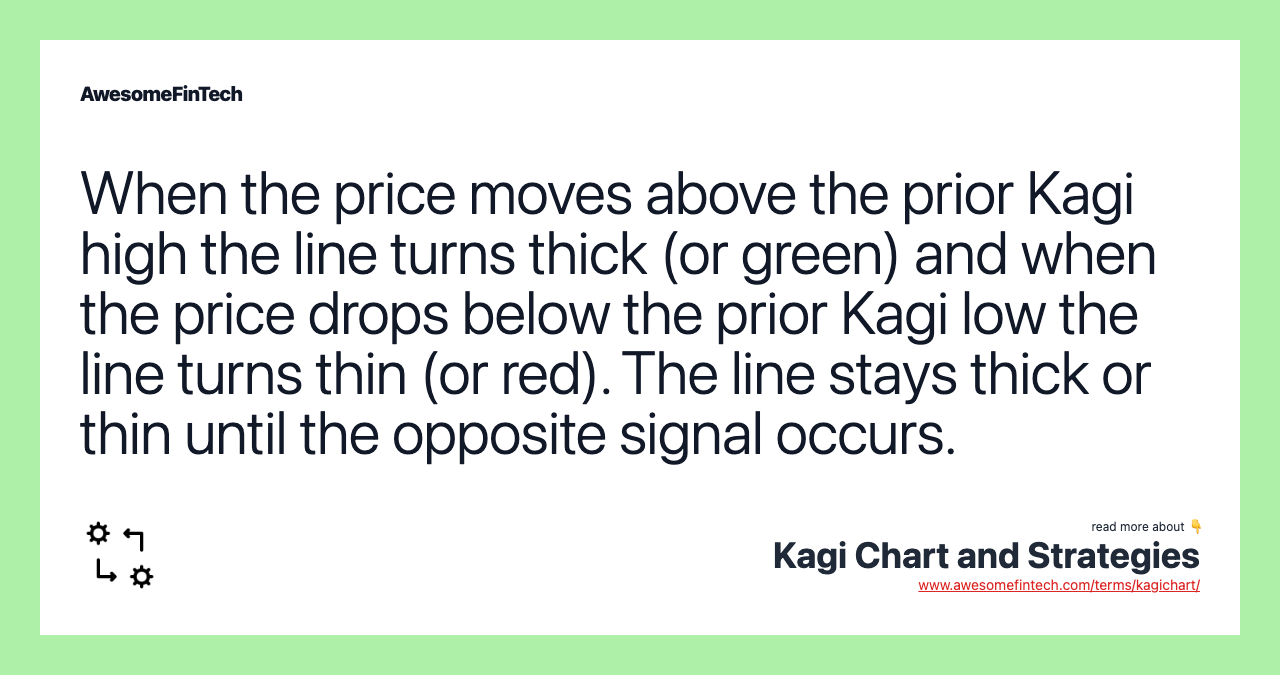
The Kagi chart is a specialized type of technical analysis developed in Japan in the 1870s. When the price moves above the prior Kagi high the line turns thick (or green) and when the price drops below the prior Kagi low the line turns thin (or red). As a general note, the Kagi switches to green when the price moves above the prior Kagi high and switches to red when the price drops below the prior Kagi low. A Three Buddha bottom is the Kagi version of an inverse head and shoulders and may generate a buying opportunity. Multiple Kagi patterns are covered in the book _Beyond Candlesticks_ by Steve Nison. The follow chart shows a Kagi chart of Apple based on 1-hour closing prices. The line turns thin when a new low is made, and stays that way until a new high is made (turns thick). The Kagi chart will move up and down as the price moves by the reversal amount, or more.
What is a Kagi Chart?
The Kagi chart is a specialized type of technical analysis developed in Japan in the 1870s. It uses a series of vertical lines to illustrate general levels of supply and demand for certain assets, including the price movement of rice, a core Japanese agricultural product. Thick lines are drawn when the price of the underlying asset breaks above the previous high price and is interpreted as an increase in demand for the asset. Thin lines are used to represent increased supply when the price falls below the previous low.

Image by Julie Bang © Investopedia 2020
What Does a Kagi Chart Tell You?
On the Kagi chart, an entry signal is triggered when the vertical line changes from thin to thick and is not reversed until the thick line changes back to thin. Like any other chart, these signals should be filtered based on other fundamental or technical criteria, as simply buying or selling every time time Kagi chart switches from thick to thin could prove costly and unprofitable.
The line turns thick when a new high is made (if the line was thin). The line stays thick as long as a new low isn't made. The line turns thin when a new low is made, and stays that way until a new high is made (turns thick).
The Kagi chart will move up and down as the price moves by the reversal amount, or more.
These charts are independent of time and only change direction once a predefined reversal amount is reached. The reversal amount is discussed below.
Kagi charts, having no regard for time, have the advantage of reducing noise. Noise is a particular drawback of traditional candlestick charting methods. Because a change in price direction occurs only after a specific threshold is reached, some traders may find Kagi charts useful in terms of isolating the trend and viewing direction more clearly.
Depending on the trading or charting platform used, the Kagi chart line may not be thin or thick, but rather colored, such as red and green. The color changes signal a drop below a recent high or low.
Kagi Chart Reversal Amount
A Kagi chart will reverse direction when the price has moved the other direction by a specified amount (or more). Assume a trader is trading Apple Inc. (AAPL) and they want the chart to show when there is a $10 reversal. A Kagi chart can show that.
If the Kagi chart (and price) is moving higher to $300, the Kagi will not reverse until the price drops below $290. If the price rises to $350, the Kagi won't reverse until the price drops below $340. If the price falls to $340 the Kagi will not reverse higher until the price moves back above $350.
The $10 reversal is a moving target. The $10 reversal can be based on closing prices or highs and lows.
The reversal amount doesn't need to be a fixed amount. It can also be based on Average True Range (ATR), which means the reversal amount will change as volatility changes.
When the Kagi chart reverses, it draws a horizontal line at the low or high price (close, high or low, depending on which is selected) and then reverses. It will continues to move vertically until there is a reversal.
These are directional changes on the chart. The lines changing color or switching from thick to thin highlights when a prior Kagi chart high or low is breached.
Kagi Chart Trade Signals
As discussed, Kagi chart signals are best used in conjunction with other forms of analysis. That said, Kagi charts do have some unique trade signals based on their formations.
Swing highs on a Kagi chart are called shoulders and swing lows are called waists.
Rising shoulders signal a rising market and a buying opportunity.
Falling waists indicate a downtrend.
A Three Buddha bottom is the Kagi version of an inverse head and shoulders and may generate a buying opportunity.
Multiple Kagi patterns are covered in the book Beyond Candlesticks by Steve Nison.
Example of How to Use a Kagi Chart
The follow chart shows a Kagi chart of Apple based on 1-hour closing prices. The reversal amount is $5.

TradingView
The chart shows examples of rising shoulders, which highlight the price rising in an uptrend. The series of falling waists signals the price is in an downtrend.
There are also three examples of the Three Buddha Bottom highlighted, which signaled buying opportunities.
As a general note, the Kagi switches to green when the price moves above the prior Kagi high and switches to red when the price drops below the prior Kagi low.
The Difference Between Kagi Charts and Renko Charts
Kagi and Renko charts are both based on reversal amounts. Renko charts are created by bricks that only move at 45-degree angles and never occur beside each other. Each brick is a specified amount. In order to get a reversal on the Renko chart the price must move two brick distances since there are no side-by-side bricks.
The Limitations of Using Kagi Charts
Kagi charts are sensitive to their settings, and with poor settings they can be as noisy as other charting methods.
Once a "good" setting is found for a particular asset, that setting may not work well on another asset. The trader therefore may need to find Kagi settings that work for each asset traded.
For some traders the trend may be harder to identify with the Kagi charts, with the line thickness (or color) changing as well as the chart itself moving up and down in vertical lines.
While trade signals with Kagi charts will have some similarities to other chart types, like candlesticks, Kagi charts have unique features which may require additional study to take advantage of.
Many of the general buy and signals generated by Kagi charts won't be profitable over many trades until combined with other forms of analysis to help filter trades.
Related terms:
Average True Range (ATR) & Formula
The average true range (ATR) is a market volatility indicator used in technical analysis. read more
Bar Chart
A bar chart shows where the price of an asset moved over a period of time and is useful for tracking prices and aiding in trading decisions. read more
Break
A break, sometimes referred to as a breakout, is when the price of a security makes a sharp move in either direction, either higher or lower. read more
Candlestick
A candlestick is a type of price chart that displays the high, low, open, and closing prices of a security for a specific period and originated from Japan. read more
Closing Price
Even in the era of 24-hour trading, there is a closing price for a stock or other asset, and it is the last price it trades at during market hours. read more
Filter Rule and Example
A filter rule is a trading strategy in which a technical analyst sets rules for when to buy and sell an asset based on percentage changes from prior prices. read more
Harami Cross and Example
A harami cross is a candlestick pattern that consists of a large candlestick followed by a doji. Sometimes it signals the start of a trend reversal. read more
Heikin-Ashi Technique
The Heikin-Ashi technique averages price data to create a Japanese candlestick chart that filters out market noise. read more
Law of Supply & Demand
The law of supply and demand explains the interaction between the supply of and demand for a resource, and the effect on its price. read more