Histogram
A histogram is a graphical representation that organizes a group of data points into user-specified ranges. A histogram bar is positive when the MACD line is above the signal line, and negative when the MACD line is below the signal line. Technical traders may be familiar with the moving average convergence divergence (MACD) histogram, a popular technical indicator that illustrates the difference between the MACD line and the signal line. A weakness of using the MACD indicator in its traditional sense, when the MACD line crosses over the signal line, is that the trading signal lags price. An increasing MACD histogram indicates an increase in upward momentum, while a decreasing histogram is used to signal downward momentum.
What Is a Histogram?
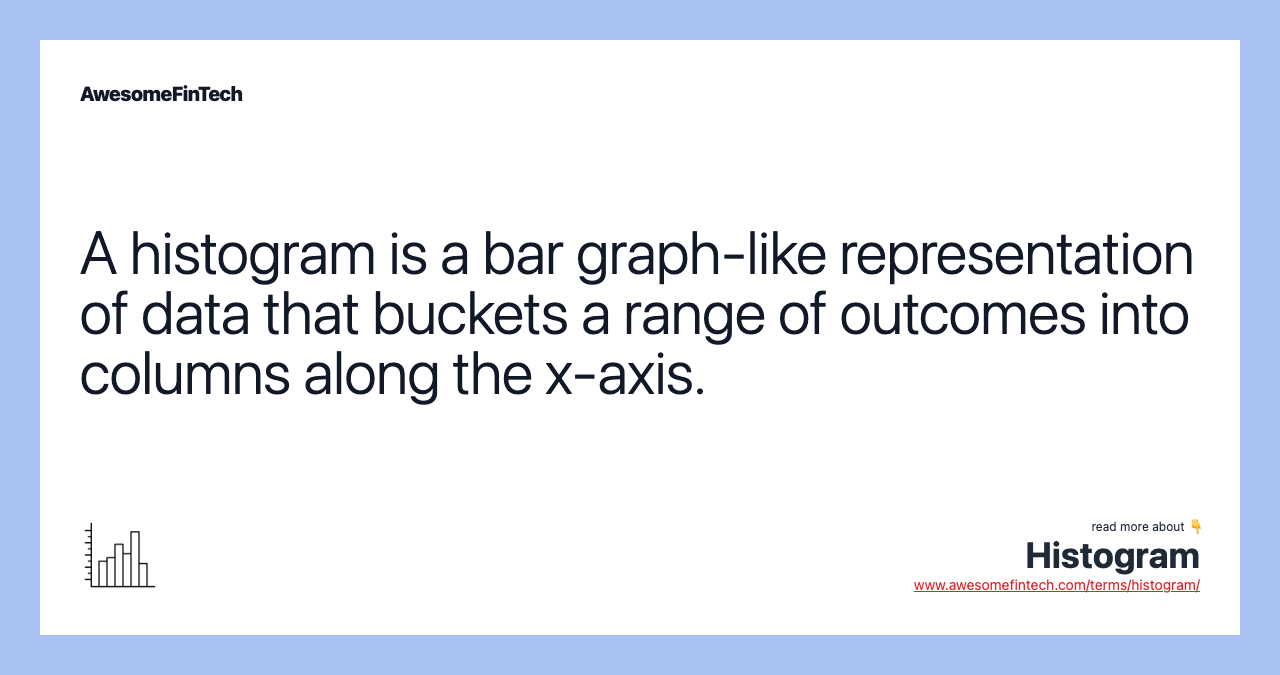
A histogram is a graphical representation that organizes a group of data points into user-specified ranges. Similar in appearance to a bar graph, the histogram condenses a data series into an easily interpreted visual by taking many data points and grouping them into logical ranges or bins.
How Histograms Work
Histograms are commonly used in statistics to demonstrate how many of a certain type of variable occurs within a specific range. For example, a census focused on the demography of a country may use a histogram to show how many people are between the ages of 0 - 10, 11 - 20, 21 - 30, 31 - 40, 41 - 50, etc. This histogram would look similar to the example below.
Histograms can be customized in several ways by the analyst. The first is to change the interval between buckets. In the above example, there are 5 buckets with an interval of ten. This could be changed, for example, to 10 buckets with an interval of 5 instead.
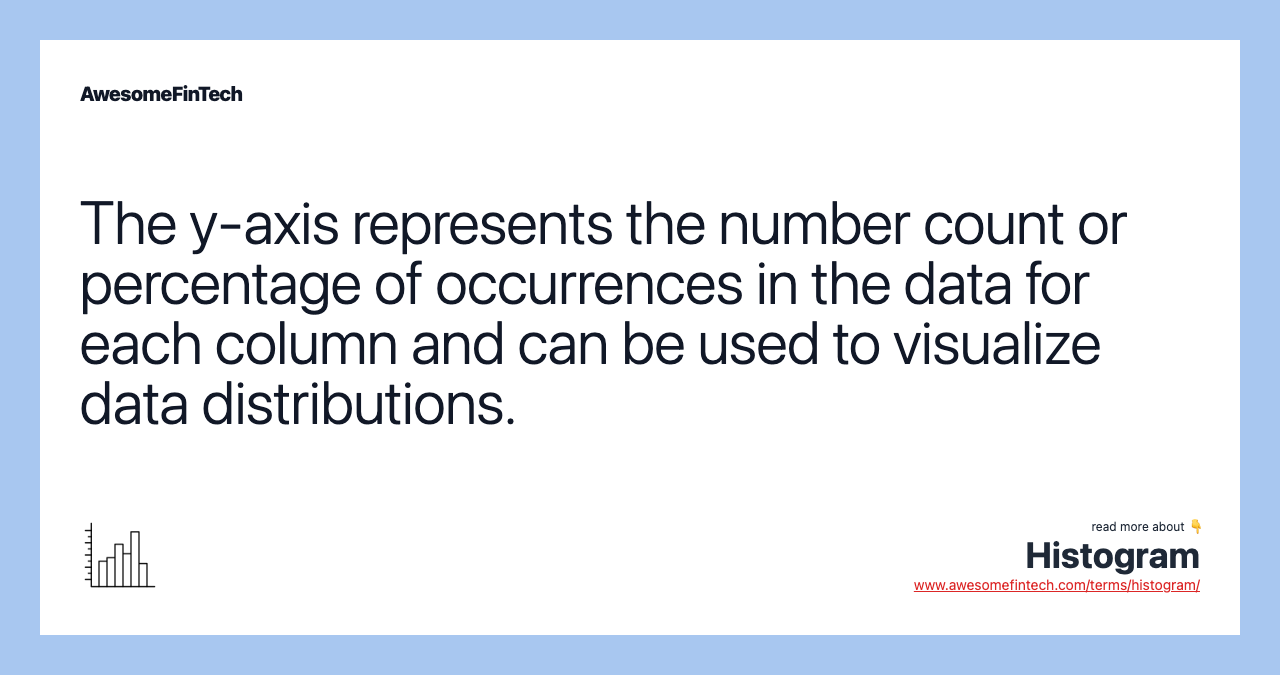
The other consideration is how to define the y-axis. The most basic label is to use the frequency of occurrences observed in the data, but one could also use percentage of total or density instead.

Image by Julie Bang © Investopedia 2019
Histograms vs. Bar Charts
Both histograms and bar charts provide a visual display using columns, and people often use the terms interchangeably. More technically, a histogram represents the frequency distribution of variables in a data set. On the other hand, a bar graph typically represents a graphical comparison of discrete or categorical variables.
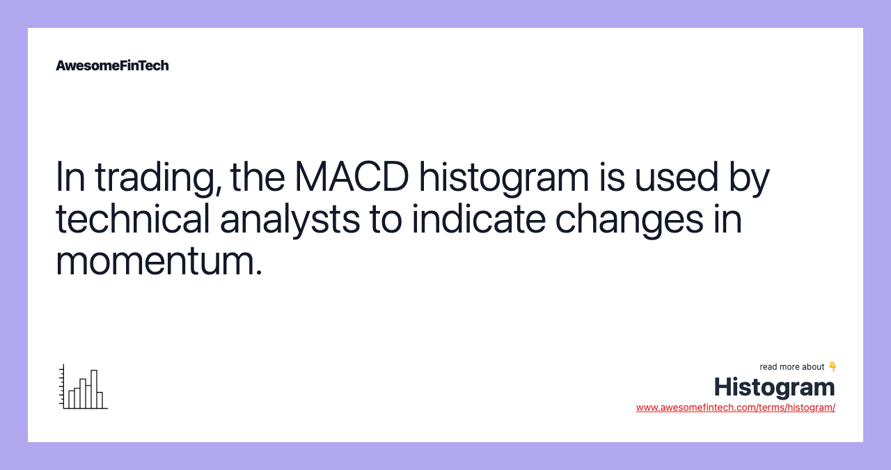
Example: The MACD Histogram
Technical traders may be familiar with the moving average convergence divergence (MACD) histogram, a popular technical indicator that illustrates the difference between the MACD line and the signal line.
For example, if there is a $5 difference between the two lines, the MACD histogram graphically represents this difference. The MACD histogram is plotted on a chart to make it easy for a trader to determine a specific security’s momentum.
A histogram bar is positive when the MACD line is above the signal line, and negative when the MACD line is below the signal line. An increasing MACD histogram indicates an increase in upward momentum, while a decreasing histogram is used to signal downward momentum.

Trading with the MACD Histogram
Traders often overlook the MACD histogram when using this indicator to make trading decisions. A weakness of using the MACD indicator in its traditional sense, when the MACD line crosses over the signal line, is that the trading signal lags price. Because the two lines are moving averages, they do not cross until a price move has already occurred. This means that traders forego a portion of this initial move.
The MACD histogram helps to alleviate this problem by generating earlier entry signals. Traders can track the length of the histogram bars as they move away from the zero line. The indicator generates a trading signal when a histogram bar is shorter in length than the preceding bar. Once the smaller histogram bar completes, traders open a position in the direction of the histogram’s decline.
Other technical indicators should be used in conjunction with the MACD histogram to increase the signal’s reliability. Moreover, traders should place a stop-loss order to close the trade if the security’s price does not move as anticipated.
Related terms:
Bar Graph
A bar graph is a chart that plots data with rectangular columns representing the total amount of data for that category. read more
Demographics
Demographic analysis is the study of a population based on factors such as age, race, sex, education, income, and employment. read more
Frequency Distribution
Frequency distribution is a representation, either in a graphical or tabular format, that displays the number of observations within a given interval. read more
Line Graph
A line graph connects individual data points that, typically, display quantitative values over a specified time interval. read more
Moving Average Convergence Divergence (MACD)
Moving Average Convergence Divergence (MACD) is defined as a trend-following momentum indicator that shows the relationship between two moving averages of a security's price. read more
Momentum
Momentum is the rate of acceleration of a security's price or volume. Momentum generally refers to the speed of movement and is usually defined as a rate. read more
Moving Average (MA)
A moving average (MA) is a technical analysis indicator that helps smooth out price action by filtering out the “noise” from random price fluctuations. read more
Oscillator of a Moving Average (OsMA)
OsMA is used in technical analysis to represent the difference between an oscillator and its moving average over a given period of time. It can be used to confirm trends and provide trade signals. read more
Percentage Price Oscillator (PPO)
The percentage price oscillator (PPO) is a technical momentum indicator that shows the relationship between two moving averages in percentage terms. read more
Signal Line and Uses
Signal lines are used in technical indicators, especially oscillators, to generate buy and sell signals or suggest a change in a trend. This occurs when another indicator or line crosses the signal line. read more